Leandro Erlich
“True poetry is a function of awakening. It awakens us, but it must retain the memory of previous dreams.”
Gaston Bachelard
“If you are moved only by the color relationships, then you miss the point.”
Mark Rothko
Almost everything in this culture that purports to be a sign of compassion or respect or care, is in every instance an expression of the exact opposite.
Politically correct terms or labels, programs from the state claiming to assist the poor, reforms designed to protect consumers, etc. Humanitarian interventions, or the war on poverty. This trickles down, as both cause and effect, to the individual and his vocabulary. On an individual level people have begun to speak and communicate in a vocabulary and grammar learned in business schools and marketing focus groups. I ran across *neurotypical* the other day, and my first thought was Aldus Huxley. This false language, in theory designed to avoid stigmatizing, is imbued with anger and aggression. The state and its *disposition matrix* is a cleansing of assasination, an expression of venal self interest and manipulation. Of contempt for others. Jargon and euphemism mesh in this verbal disposition matrix, as it were. This first became truly visible during Viet Nam (Terminate with extreme prejudice). ‘Neurotypical’, or ‘differently-abled’, ‘pivot’, and ‘walk it back’, ‘pre dawn vertical insertion’ was invading Grenada, or the financial Greenspanisms such as ‘accelerated risk premiums’ (which means exactly nothing) and simple ones now just so familiar nobody notices; ‘downsizing’, ‘recession’, or ‘double dip recession’, and ‘for your convenience’ which usually means the opposite, or ‘miscertification’ (which I believe goes back to the Watergate hearings), or a dozen others. The embedding of this nastiness, this intolerance, never mind the peculiar sense of contradiction it encloses, has become the conversational currency of today. And it is a form of intolerance. It is denying certain narratives, certain images, certain ideas. In each case it reduces meaning, metaphor and allegorical potential. One is not erasing abusive bigoted beliefs by changing words. Its a lateral move at best. And the irrational violence to meaning, to language itself, is cloaked in mystification. This is not to suggest words don’t matter. They do matter, but they are organic living things.
Robert Ryman, Pace Gallery
I suspect in a way this is an even more painful intellectual star chamber than appearing before Cardinal Wolsey. This raw nerve is tender, and the fear of having this nerve touched drives a lot of this worry about correctness. Of course there is a celebrity left, best exemplified by Zizek, whose role is to grant permission for the pent up angers of frat boys and white upholders of purity to express bigoted racist and homophobic beliefs (and to apologize for Imperialism). Zizek is the ideological clove oil to apply to that aching tooth. One sees white male aggression expressed, often, under cover of common sense. Bill Maher, a nasty vain little man is the poster boy for this tendency. The revanchist white male as heroic figure of pragmatism and realism.
“Buildings, like texts, are inserted into the world of dissimulation to speak of an unattainable order beyond it.”
Mark Wrigley
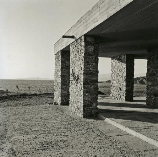
“Anávyssos House”, Aris Konstantinidis architect, 1962, Greek coast near Athens.
The public sees itself in a movie. We look at the world in terms of film, film narrative, and in film space, too. The internet has been sold in kitsch narratives of revolution, with social media as an organizing tool etc. Groups communicate and overthrow a dictator.They all buy a Prius and ban plastic bottles. The selling of Tiananmen Square or Aung San Suu Kyi. That’s a movie. Takes place on location. The non movie part is the parking lot surveillance, the stock market shares, the leveraging and political clout that mounts the assault on net neutrality, buys patents and steals intellectual property, and the NSA. Paying lobbyists, and mergers etc, are not a movie and hence not very thought about. But there is also the purely addictive part, the manipulation, and the creation of new temporal zones of behavior. There are the new spaces, the airport zone of hyper security where time stops. The Casino, where the world tilts toward your addiction, literally.
http://www.theatlantic.com/technology/archive/2013/07/the-machine-zone-this-is-where-you-go-when-you-just-cant-stop-looking-at-pictures-on-facebook/278185/
Gaston Bachelard
“…The polemical exhibition of modern buildings in 1927 had a kind of off-white. It takes
a long time to become a white white, like that of a Richard Meier building today which is
completely unlike the white of classic modern architecture. The pioneering buildings had more
like an eggshell colour, so there is a way in which modern architecture whitens over time. One
could argue that it does so as a reaction to the black and white photographs.”
Mark Wigley
So, these forces have intensified, but the effects of photography, of magazines and then cinema — has been to shape aesthetic space, but also to alter our dreams. That sounds obvious enough. Hollywood likes to promote itself as the dream factory, but in fact they are the dream abattoir. Dream killers. A Dream Disposition matrix. Much as curators became like studio executives or like agents, the artists were torn about how find the zone of resistance in both narrative and image.
Now, it is interesting to remember that much Greek statuary was painted, and that early 20th century architecture was not white, but often pastel, or even a dark primary color. This was Van Die Rohe, but also Le Corbusier. Flat roofs and white walls. Except, they werent white. The majority were egg shell or off white. It is worth looking at the stone buildings of antiquity, as well as village structures in North Africa, Greece, Sicily, and even South America and Spain. Flat, and white. White suggested clean because it was, it was white wash. Lime wash. Mark Wigley suggests visual hygiene trumped the bacterial hygiene. Perhaps. And indeed Le Corbusier was interested in purifying the eye. Now, in a sense, all artists are purifying the eye, all visual artists anyway. They just do it in different ways. But in architecture, where space mediates all other concerns, the role of poetics, and allegory loom very large, as does the role of control.
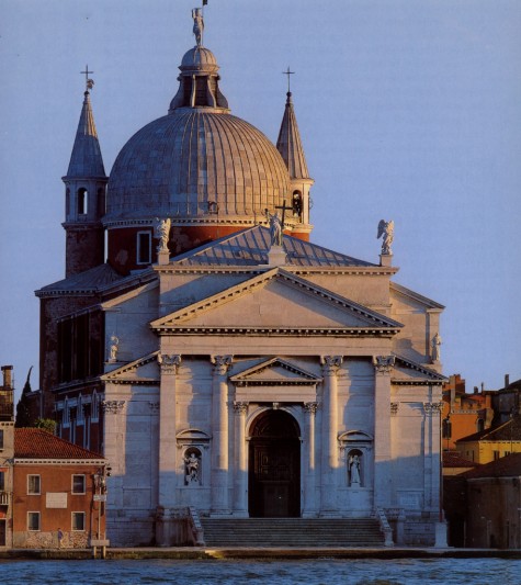
Chiesa del Santissimo Redentore, Andrea Palladio architect, 1592
William Gass, years ago, had a sort of wonderful small book on *blue*. And perhaps we all have our favorite talismanic color. Or colors. When I first travelled in Asia I became infatuated with reds. Chinese reds in particular. The point being that the sense of post industrial desires for hygiene came into play with the idea of the doctor’s coat, the white tiled industrial bathroom. In fact the non white bathroom, even when I was a child, suggested a certain wealth and cache. The poor were herded to the white tiles and white smocks. It is interesting that doctor’s coats had earlier been green. Green was a surgical color.
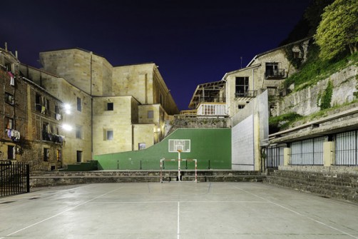
Phillip Lohofener, photographer.
“…processes have left residents of low-income neighbourhoods in a situation where, since they exert little control over either investment capital or their homes, they are facing the ‘choices’ of either continued disinvestment and decline in the quality of the homes they live in, or reinvestment that results in their displacement.”
James DiFillipis
The evolution of ideas of cleanliness is complex. (http://www.theguardian.com/society/2014/jun/07/anti-homeless-studs-london-block-uproar?CMP=fb_gu) Today the poor are no better than bacteria, or at best pigeons. (http://www.dnainfo.com/chicago/20140523/avondale/new-anti-homeless-structures-have-residents-split-alderman-stymied).
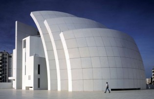
Jubilee Church, Rome. Richard Meier architect.
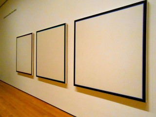
Jo Baer, MOMA

Herbert List, photog.
As the site of early memories, I suspect the evolution of private space has reacted to the psychic formation we experience; that closets were not JUST about hanging clothes. Public buildings, the symbols of power, often, were also linked to the role of Gods, and of divination. Architects such as Zaha Hadid, or Rem Koolhaas, and Bernard Tschumi (all of whom sort of lept into public significance at the Deconstructionist Architecture show at MOMA in 1988) are in the business of eliminating the Gods, and creating a kind of exaggerated instability, but an instability (if thats the word) that is about finance, about class interests and about non-integration. Rowen Moore, architecture critic, calls a certain strain of design ‘The True Fake’. The idea is that certain buildings appear to be doing something, but are not. Often in fact are doing the opposite. Hadid is that kind of architect, or rather Dame Zaha Hadid, who at age 61 has only twenty some buildings in her resume. The triumph of appearance and image. (and the triumph of…what Garry Stevens suggests below*). I want to give a partial pass to Frank Gehry, because try as I might to NOT like his work, I often do. But my point here is buildings such as the Galaxy shopping center in Beijing, by Dame Zaha, is a monstrosity. I’m not sure monumental public spaces can get much more ugly (go ahead Google it if you don’t know it). The deconstructionist trend was not really a movement, it was an attitude. And the reason I mention all this is because the return to intimacy and secrets is a screaming need today. Chinese Pritzker winner Wang Shu (who I wrote about before) is one of the exceptions. Jean Nouvel is a mixed bag, but at his best has created a number of exceptional buildings. Then I think Id have to go back to Barragan and Scarpa to really feel the metaphysical and poetic. The point really has to do with how these monumental projects reflect a kind of fear; and it is a fear that fits into the landscape of fear and security that is the modern city. But what does that mean? Landscape of security is obvious in a sense. It is a place of thousands of CCTV cameras, of visible police, and of class segregation. Barriers, anti homeless spiked benches, and overall enclosure of the underclass. The private life is the theatre of intimacy; a topography of secret urges and desires. Today there is a culture in which solitiude is ever more difficult to find, in which privacy has eroded; the rooms we live in, the rooms we grew up in, are either small bunkers, or simply cells. Solitude has become solitary confinment.

Jan Steen, 1650 apprx.
Intimate spaces are never the spaces of fear. One of the problems with much modern architecture is that it is overly ornamental, but today that visual plumage, that ornament, has taken the form of a fanciful prison that robs us of intimate space. The ornament is now replicating the psychic heavy hand of punishment. A brutalist visual slap across the face. This is the ‘true fake’ idea, again. Presented as monumental or ‘people friendly’, they are uniformly antagonistic to the human. And here is where this the over use of the new ‘white’ becomes relevant. A white that demands it stay white it not liveable. Only the hired help can keep a building white. How does one remember a Richard Meier building? I cant remember them, except as I might remember a dental clinic or discount electronics warehouse. Memory is housed in shadow. Meier creates totalitarian dwellings. Which is perhaps at least a minor improvement over Hadid’s kitsch. In theatre, the empty space is already the start of memory. Childhood contains, almost always, time alone, and those spaces of privacy are where one is educated in dreaming. Today in the West, everyone is an extrovert. Even introverts are extroverts. The reliance in instrumental thinking is on the exterior. Interiors are really exteriors. This is the shopping culture, too, of course. The mall is a faux street, sanitized and controlled. The marks of progress included removal of cellars and attics. And the illumination of shadow. The exteriorizing of space is the new pathology of extroversion.
But here it is important to understand how Capital intersects with all this.
“…spacial fixity also becomes an increasingly vital underpinning to social development.” “…we do not live, act, and work ‘in’ space so much as by living, acting, working, we produce space.”
Neil Smith

Vija Clemins
Since Francis Bacon, the idea of nature was shaped by an exteriorized construct. For industry, nature was there to be transformed. For the U.S., the primary image or symbol was a virgin wilderness landscape. A wilderness begging to be changed into productive industry. There was an idealizing of wilderness, of nature, but beneath it pulsed the engine of conquest. For all the romantic narrative attached to the wilderness, the real heart of American capital saw savages and a natural violence. The Puritans were no lovers of nature. They at best sought to co-exist with it. Richard Slotkin’s trilogy on American mythology saw clearly the gunfighter nation, the “redemption” through violence. As Neil Smith rightly points out, the return to nature idea was born in cities, in literary salons. Ladies Home Journal and House and Garden, or the Sierra Club were urban entities. The frontier was seen with fear and disgust by those living there. The ‘idea’ of nature was something that was part of self improvement. Boy Scouts and vacations. The idea of the mastery of Nature runs alongside the aesthetics of mastery in narrative, and poetry. The mastering of a craft. One’s imagination was akin to the wilderness (but not really, the wilderness, just nature, and even Central Park could stand in on occasion). It is easy to underestimate the polite pastoral frame that presented the bourgeoisie with their idea of the frontier. Unfortunately the conquest of nature, its domination, brought with it the domination of man by those who profited most from the subjugation of nature. By those who were actually furthest from the material business of conquest. So, there is an aspect of this spatial organization that is directly linked to Capital, to class division, and to expansion. And the effects of Capitalist expansion, of industry, and the physical plant of Fordist production, helped shape western consciousness about…well, everything. The frontier migrated overseas (and vice versa). Colonial domination was a deeply internalized revulsion. Included in the landscape of foreign wilderness was the native population.
However, by the end of the second World War, I think there had been a continual erosion of a certain romance attached to the wilderness and frontiers. There was an almost, or at least partial, distancing from rural life, a cognitive space created between urban sophistication and rural hardship. This process began, I think, probably at the turn of the 20th century. The city took on its own sense of self generation, its almost anthropomorphic identity. Cities in the U.S. got nicknames. The city of big shoulders, The Big Apple, The Windy City, Bean Town, The Big Easy, City of Brotherly Love, or even in deprecation, or slang; the Mistake by the Lake (Toledo), and my favorite, The Fire Hydrant Capital of the World (Albertville, Alabama), etc. They slowly were being branded in a sense, long before tourist bureaus. The exteriorized consciousness. At the same time there was an evolution of office space that reflects a similar trajectory. Hans Poelzig’s I.G. Farben office building in Frankfurt, of the late 1920s, which was later taken over by the U.S. military, may have been the start of the partitioned cubicle, which became the iconic image of the lonely crowd. The actual template was created in 1964 by Robert Propst, and implemented through Herman Miller’s furniture company in Michigan. This was the now familiar ‘workstation’ idea. The most hated quality of this model is the noise pollution. And that invasive non-stop audial assault is, in a sense, symbolic of the general hostility to low end bureaucratic workers today. Martin Filler’s piece in the NYRBs on the topic of office space ends with an appropriate nod to Jay Nolte’s web comic Zombie Office. In a nation now of temp workers, non unionized and unprotected, the early concerns of architects and designers like Adolph Loos or even Corbusier, seem almost quaint. The image of Zombie seems to have traction today in how the working class and unemployed are viewed. The early 20th century architects such as Neutra and earlier a Gaudi or Charles Rennie MacKintosh were creating space that emphasized a human scale, and something idealist, they concieved at times in white, though usually not, but there was nothing authoritarian in that work; not in scope, or spirit or intent.
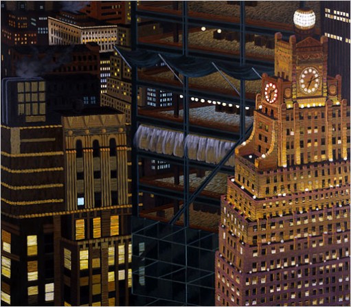
Yvonne Jacquette
As Beatriz Colomina said, in an interview in Architectural Review:
“AR How does Playboy treat architecture in its pages?
BC Everything that happened in architectural discourse is presented in the magazine but it’s sexualised. They started featuring Mies and Frank Lloyd Wright, and then in the 60s and 70s they started Playboy Pads, a series that reshot existing buildings…”
Its quite possible that in a hundred years, Walt Disney and Hugh Hefner will loom as among the very most significant influences to modern culture in the last half of the 20th century. Space was inscribed with infantile simplicity, and an narrative of titillation.
“The building should be understood in the same terms as drawings, photographs, writing, films, and advertisements; not only because these are the media in which we more often encounter it, but because the building is a mechanism of representation in its own right. The building is, after all, a “construction,” in all senses of the word.”
“Le Corbusier sees the house as constructing pictures, or scenes, as about movement through space as the unfolding of a movie or a narrative. (In fact, he, one of his houses, and his car appeared in a film, L’Architecture d’aujourd’hui, 1929.) For Le Corbusier, houses built spectacles. Houses became mechanisms for seeing, as evidenced by design sketches that begin with postcards pasted to the page (the tourist site/sight) and that figure the human by a large eye.”
Beatriz Colomina
The architect today is creating space that mimics photography, or more, perhaps, mimics the movies. Buildings such as those of Hadid, Libeskind, or Koolhaas are movies. Once in them, the occupier is not aware of his own place in these spaces, for none of it is not pre-occupied.
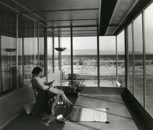
Miller home, Palm Springs, Richard Neutra architect. 1937
Magazine ads, that began in black and white, amplified the tendency toward design white as privilege. Contrast signified privilege. But it is films, the culture industry, in which notions of building take on a more sinister quality. Homes are not designed, now, to turn occupants inward. Rooms prioritize picture windows, even if the view is of an apartment dumpster. The house looks like a screening room for dailies. Bedrooms are based on a fantasy borrowed from soft porn TV, and kitchens are Spartan non-participatory. The interior is presentation, prepared for the eye of the camera. I suspect, if one examined the interiors of mid century architects with those of the 21st century, the interior design would have shifted from still camera, to tracking shot.
The principles of exclusion, the fear of contamination, that pervade the proprietor class, have started to self contaminate. They exclude themselves. For it cannot be otherwise. Perhaps in one sense, all Empire starts to fail when this happens. It is both cause and effect.
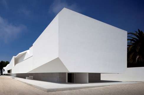
‘Porto House’, Alvaro Leite Siza Vieira, architect. 2010
How to Become a Super Star Architect (Garry Stevens)
*Have rich grandparents. First-generation wealth is no help. The vulgarity of mere money must be transmuted into a class position, and that takes at least two generations. You must have class! Then your parents will happily indulge you when you ask them to pay for the years (or decades!) of hefty financial support that you need to…
Study at the right hip school, such as the AA, Harvard, or Yale. While there you will…
Refine the exquisite tastes and habits that will mark you forever as one of the culturati. And your parent’s and your school’s connections will enable you to…
Get into the most-talked about practices. You won’t have to design any real-world buildings, of course: just hang around and absorb the vibe, spending your time drinking ginseng tea with your boss on his many international junkets. He can then use his (oh so rarely her!) connections so that you can…
Meet the right critics, who will talk about you, and publish all your drawings for architecture that no one actually wants built. While you are waiting for that to happen, you will…
Return to teach at the hip schools that taught you. There you can earn a living with minimal effort, since your own unbuilt works will be the ready-made basis of all your courses. True, the salary will not be huge; but since most of your income derives from your wealthy parents or trust fund, that really does not matter.
“White suggested clean because it was, it was white wash. Lime wash. Mark Wigley suggests visual hygiene trumped the bacterial hygiene. Perhaps. And indeed Le Corbusier was interested in purifying the eye. Now, in a sense, all artists are purifying the eye, all visual artists anyway. They just do it in different ways. But in architecture, where space mediates all other concerns, the role of poetics, and allegory loom very large, as does the role of control.”
I remember vividly visiting the grounds of the Sachsenhausen concentration camp near Berlin twenty years ago. The most viscerally horrifying thing of all, for me, was the whiteness and antiseptic purity of the former medical experimentation building.
I wish I was more aware of the language of architecture. I’ve never really had anything past a passing curiosity about how architecture worked as an art form and what kind of philosophies are behind different kinds of spaces. Maybe it’s time to catch up.
A few things: I notice that when you talk about “film”, the medium itself seems to have much more inherently disturbing undertones to it than theatre and literature. Obviously you speak a lot about film as a genuine artform, but there also seems to me to be the feeling that playing with film is like playing with fire. I’ve felt similar things myself — I love film and I hope to be a director some day, and yet I can’t shake the feeling that it’s somehow… wrong. After all, film is capital intensive. It takes resources, resources far better spent elsewhere — and plus, why film and not theatre? Theatre is accessible to all. If you have a text, anybody can play it. Shakespeare costs nothing. It’s inherently egalitarian. Is the allure of film (I’ve always subconsciously felt cooler identifying as an aspiring film director than an aspiring playwright) the allure of elitism? Or…?
I live in Beijing. That so called building is ugly as hell. There are plenty of those kind here, like most urban centers. But what really gets me is the capitalist colonialism:
http://www.zaha-hadid.com/architecture/galaxy-soho/
“Internal world of continuous flowing space” sounds really disturbing. What they’re really saying is a completely open space where every inch is commodified, because you have instantaneous access to all the shopping features in this space, and there are no barriers. “Immersive, enveloping” — basically, you can’t escape from it. You can see from the curves how deliberate and precise the manipulation is: the deliberate avoidance of straight edges, which they boast so much of, maximizes your surface area of contact with visual stimuli. It also creates a sense of a self-enfolding, self-observing crowd: you can see EVERYBODY shopping EVERYWHERE and you can’t escape it. Self-panopticon. You used the metaphor of buildings now being tracking shots — I’d like to add that those curves are a specific kind, they’re steadicam architecture.
So much for the curves.
As regards to the amoeba-like irregularity, one gets the sense that the curve themselves would not be such a problem if they were symmetrical, because that way at least you can orient yourself with spatial memory. Irregularity throws you off, makes it just that much harder to place where you are — turning the building into a maze, one wrong turn and you can forget where the escalators and exits are. Good luck! (Plus what the tech article says — creating just enough variation in stimuli to keep you clicking on the next FB picture, this is the identical principle of varied stimuli adapted to architecture)
And the scary thing, PRECISELY because how apparently organic, flowing, unpredictable etc. the building is, it hides its precision manipulation very well. Hence the obsession with “organic forms” in modern architecture. If your building is shaped like a factory, you KNOW you’re being manipulated, but if it’s shaped like an amoeba… anything goes.
So much for capitalism, but here’s colonialism: “re-inventing of the classical Chinese courtyard”. BUUUUUUUUULLLSHIT! Holy crap! The whole principle of a Si-He-Yuan — literally, a “four-together-courtyard”, is that you have houses on four sides, and that the courtyard is a square. The houses are important as enclosures — the space of family. The courtyard is where you wash your clothes, your food, and of course, the communal space, where different families come together in a community. BUT you can’t have the community (public) without the private! If you have one seamless immersive space with no outside and no inside, as the brochure so proudly proclaims, you have neither private nor public! That’s not even mentioning that a Si-He-Yuan only works because, guess what, THERE ARE ONLY FOUR FUCKIN FAMILIES SHARING ONE COURTYARD. By definition. As any rudimentary understanding of Chinese will show you. It stops being a classical Chinese courtyard if you have millions of shoppers in there, it’s too big — an absurdity. BY DEFINITION. The cultural appropriation and misunderstanding is just astounding.
Heh, I got carried away. It makes me angry to see Chinese culture misused, though.
I’m glad you mentioned Wang Shu. He’s a true inspiration. What he’s doing is so difficult because, in addition to the decadence of architecture itself, there’s also the issue that colonialism makes most “prestige” art-forms European in focus. That has always been a perennial problem for any Chinese person wishing to do art. How to get past the alienation. Which is why what Chinese artists like Wang Shu have to try to achieve is something like jumping across the abyss — a leap of faith. And the fact that he achieves it is phenomenal.
—-
“When Bachelard wrote of drawers and chests, and closets, the places where people kept, metaphorically, their secrets, he was suggesting an inner topography.”
This is very interesting. I remember I used to keep some beautifully wrapped love-letters from my long-distance relationship in my drawer. Later on I had a sort of crisis with my life, so I took an extended open-ended break by going to the US for six, seven months, just figuring out what’s next. I broke off my relationship during that trip. When I decided to come back to China my family was just in the middle of moving house, and during that process my drawer was cleaned out in my absence. I still don’t know, now, where those letters went, and remembering it suddenly made me feel uncomfortable because of this vague invasion of privacy, bla bla.
But this made me think of something else. Our family had always moved a lot — never outside of the country, so no culture-shocks per se, but a new home every 2-3 years ish. This remembering of a minor “trauma” (if that’s the right word) just made me wonder if there were previous discomforts that happened from the clearing out of private places like these, which I had forgotten or repressed. I mean, a drawer, a closet, means something very different if you have a settled house, isn’t it? If you’re “rooted”, whatever that means. But if it’s cleaned out every 2-3 years, it means something completely different. I wonder if it’s a lack to have never had a settled private place. What the psychological implications of that is. And how that links to my upbringing as an outsider, third-culture kid (the constant moving more an expression of my family’s constant need for changing milieus, at least partly), or as I like to think a “cosmopolitan”. And what that means for art. I’ve had trouble baring my deepest fears in my writing, it’s a constant fault that stares back at me — I keep trying to censor myself and make it safe, for fear of being “found out”. And I wonder whether that is purely a problem of craft, or is it a metaphorical inability to open my private drawer, so to speak.
Anyways, just some thoughts, enough rambling, I guess….
@exir
Well, first off, what you say of the Galexy, and Hadid’s work, is so exactly correct. And the “organic” shape ….this is what i meant (and you say also via steadicam) is that its a tracking shot. And because of that, its like walking in a Bourne movie. The architectural equivalent of ADHD editing. There is never really a space to occupy. I think thats partly what i meant by pre-occupied. There is no place for individual …..and beyond that, its so inherently ugly, for lack of better description. The scale is also anti human somehow. I remember the fist time i was in a frank lloyd wright house, the impression was of his sensitivity to scale. It was remarkable. Hadid has no sensitivity to scale at all.
now as for film and theatre. This is a real conundrum. But i agree, there is something that nags at me about all film. Much as I love it, I am bothered by my seduction by it, and so much of what I love about theatre is missing in film. I shot a short film in norway, with money from the Mid Norsk commission. A 20 min film. I was happy enough with it, but i hated the making of it. It wasnt cooperative so much as I felt like shop foreman. I am sure there are ways around this and in a sense Fassbinder and Pasolini managed and bresson…..they really did I think, or even Tarkovsky. And dryer.But not completly. They all in different ways found strategies for subverting the sense of alienation that exists in the making of a film. And of course part of this is economic. Its very expensive. A micro budget film is still over half a million dollars. Thats partly the problem right there.
But its more than that, and I should think more on that and write a post about it.
The courtyard. This is true of Islamic architecture too. I love islamic buildings. They are inclusive and humane. I have less experience with chinese building, but i sense similarities. Wang Shu is extraordinary. His use of discarded materials also informs what he builds. He is constantly working against the elitism and false monumentality of projects. If you go back to Gaudi, you see something , in a different way, of the same idea. And even in Bauhaus….much derided for some reason, because i think mis read…..but what strikes one about the bauhaus , for me anyway, are the interiors. Loos too, and later Neutra (who studied with Loos). Neutras buildings Ive been in, since they dot southern california. Or even…..the so called mid century guys who practised mostly in palm springs. Krisel especially http://www.dwell.com/interviews/article/william-krisel
these are remarkably liveable houses. There is something modest in the design and scaled for human life. But Frey too, all of those architects loom as significant today.
I think i will write a lot more on the Bachelard stuff. I think we , as a culture, have lost something very important in terms of intimacy, and the space to day dream and reflect. Its part of this program of forced amnesia today. And when i see a Meier building or foster or hadid, I see a kind of amnesia. And i feel assaulted somehow.
@jerome
yes. right.
i do need to track that more, I think, because its fascinating.
@Exir,
Just because you forget/repress/censor the “minor trauma (…?),” does that make you “safe”? I wonder if you may be perpetuating a different kind of violence by refusing to open that “private drawer…”
That’s an interesting thought. Intellectually I understand the need to refuse censorship, but psychologically it is difficult, especially when I’ve always had trouble “owning” my own private feelings. Not sure how to explain…
Exir,
Great. And that is why you write, not to explain, but to struggle with what is difficult.
Explaining something kills it (there is a paradox lurking in here somewhere, but not necessarily a contradiction). When I think about my experience of “great art,” it seems to me that the art is not about capturing something, or understanding an experience, idea, phenomena, etc.—great art is about opening up the existence of the subject being explored by showing that it is so much more than we can ever hope to understand… perhaps that is why great art keeps living long after it has been “created.” Are not the most beautiful works of art also the most unsettling? How is it even possible that Shakespeare—with those repulsive human emotions of shame, jealousy, entitlement, alienation—found the poetry of Macbeth? Or maybe the question is, how could he not have…?
And, I honestly don’t know… do we “own” our own private feelings? I think we must take responsibility for our (re)actions and impacts in the world—something that institutions (i.e. medical, academic, government, law, bank, etc.) and bureaucracy seem to have made increasingly difficult to do. Taking responsibility can be terrifying, alienating, and disorienting, but I think it is far more important than “owning” ourselves/our feelings. “Owning” suggests possession to me; responsibility suggests sharing, suggests a recognition of our impact on the “other” and the “other’s” impact on us. I suspect that responsibility (and when I’m using this word, I would like to colour it with a sense of vulnerability), that responsibility is perhaps, impossible and somehow unattainable. I think it has something to do with constantly re-questioning, re-examining, re-orienting one’s being in the world with/through others and space.
After reading your last response, what I thought was most interesting, was not what your “private feelings” might be, or what your “minor traumas” might be, but that you are “not sure how…”
God, I wish I could use italics on here.
of course, I’m not just talking about “great art” or about writing; I’m talking about being human… (another loaded and multi-defined word/concept, I know. Not sure if I should put certain words “on hold” or just risk using them while I continue to try and figure out what they might mean).
Apparently, “4 +9 = thirteen” has just verified my humanity, so I guess basic algebra fits into this somehow…
And I got “1 x five = 5” to verify my humanity…
Thanks for your comments. The part about the distinction between “owning” and responsibility was particularly helpful.
I guess we all face the problem that, growing up, there are certain emotions we are discouraged from experiencing. Which means that we spend the rest of our lives trying to figure out how to reconnect with that cut-off part of our “humanity”.